
Meople
Product Design • User Research • Usability Research • Wireframing
Leading 0-1 product design for an early stage SaaS startup that allows users to customize physical and digital games.
2024 – 2025

Overview
Meople is an early-stage SaaS startup that empowers users to turn personal stories into custom physical and digital games.
As a 0-1 product, the challenge was to create a unified and frictionless experience that could handle high product variability (ranging from board games to digital card play) while maintaining a professional output for both individual creators and B2B event facilitators.
Role
As the lead product designer, my responsibilities spanned end-to-end design: brand identity, user testing and research, design system, IA, UI design, and prototyping.
Tools
Team
2x Designers
1x Engineer
TLDR;
Objective
Key Results
I redesigned a Meople’s customization process to solve the significant drop-off rate. By shifting from a manual editor to a template-based editor, I helped Meople transition from a conceptual MVP to a scalable SaaS service.
Onboarding: 25% reduction in onboarding time
Conversion: 7% increase in user conversion rates
Efficiency: 50% boost in team efficiency through a design system.
Background
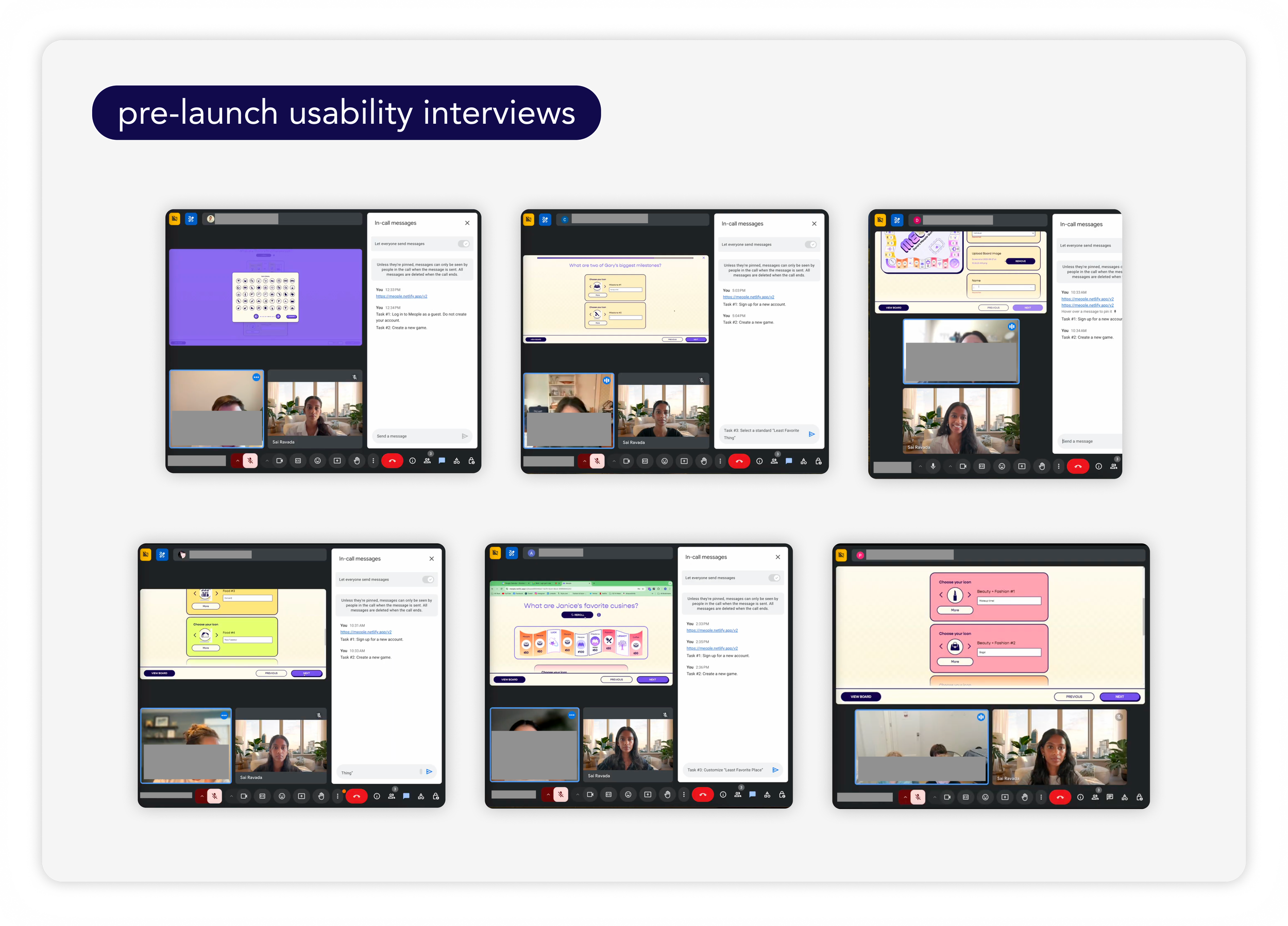
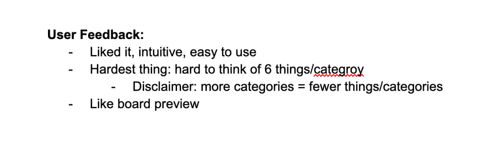
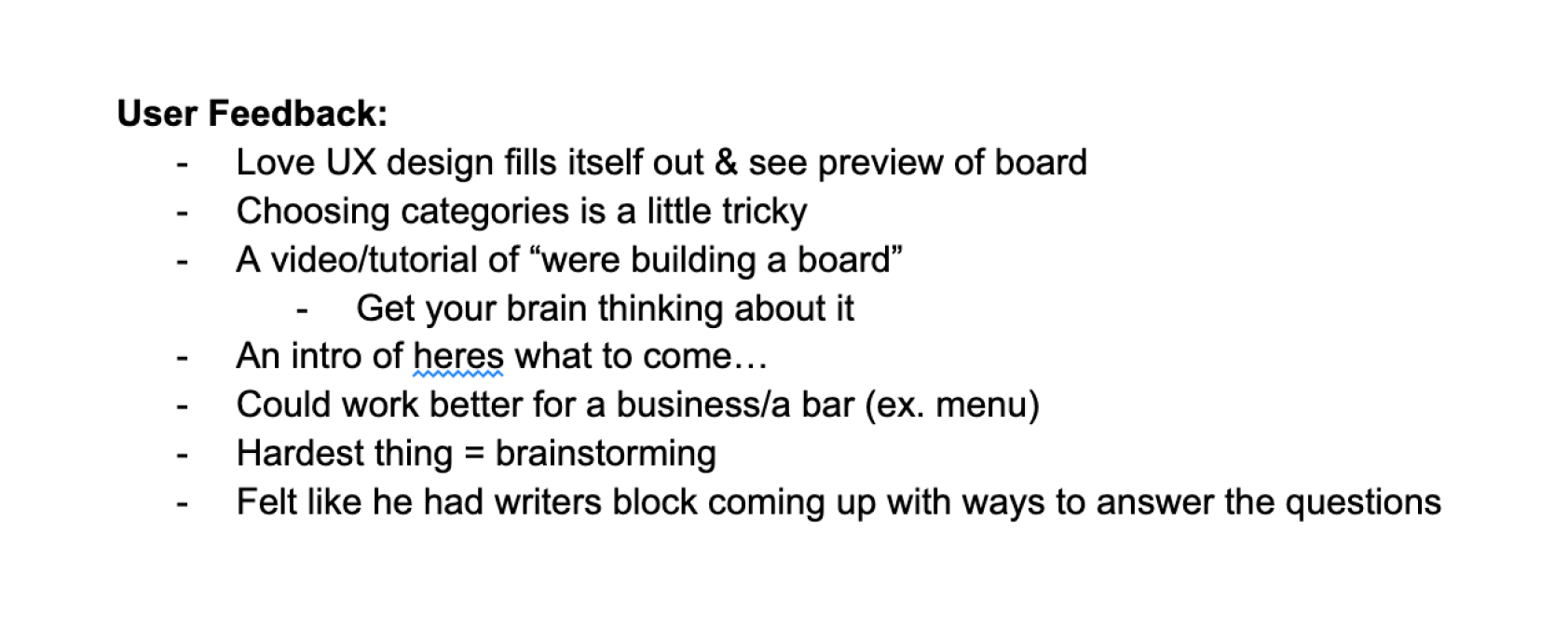
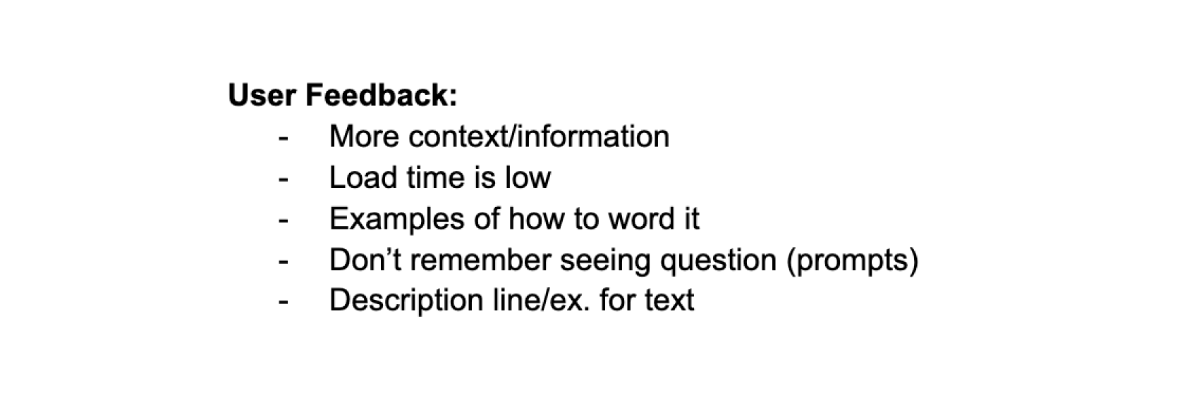
When I joined in September 2024, the priority was reaching a launch-ready state. I conducted a series of Zoom-based user interviews with early testers to identify the immediate barriers to a successful launch for our MVP.
At this stage, our focus was on fixing the kinks. The interviews revealed technical friction points and usability bugs that would have stalled the MVP.
We focused on stabilizing the core customization engine and ensuring the board game product flow were functional and cohesive.
We successfully shipped the MVP in February 2025, marking our first transition from a conceptual tool to a live service.
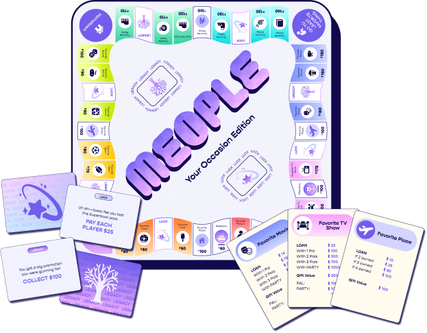
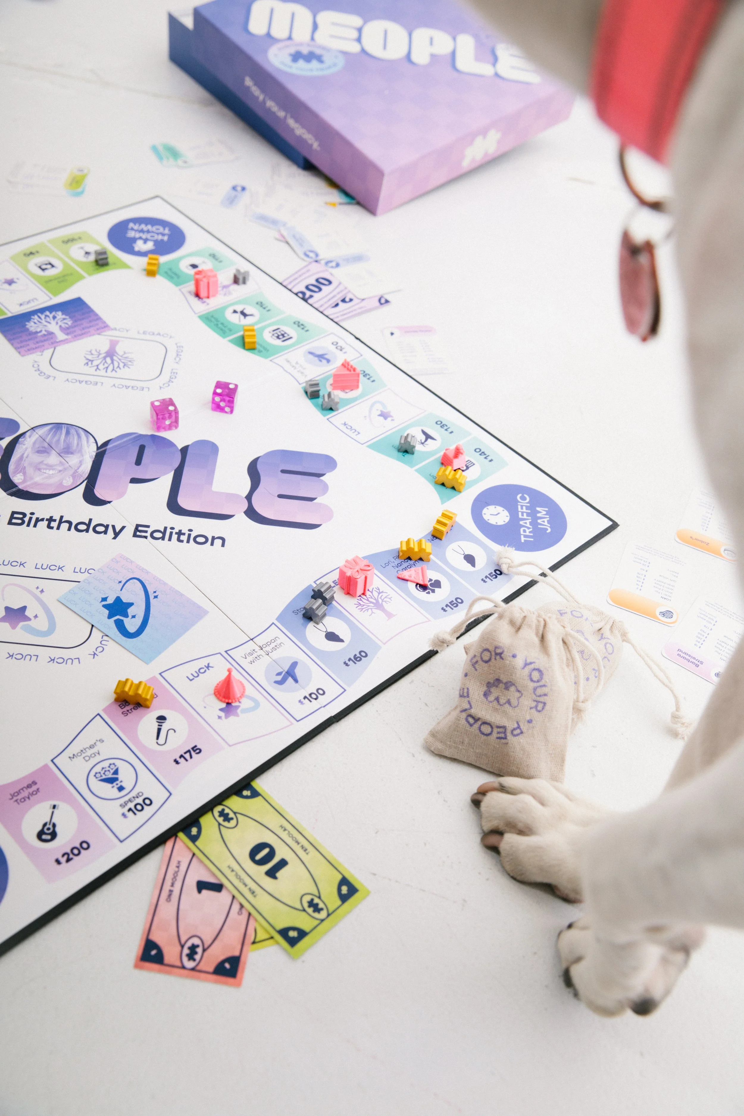
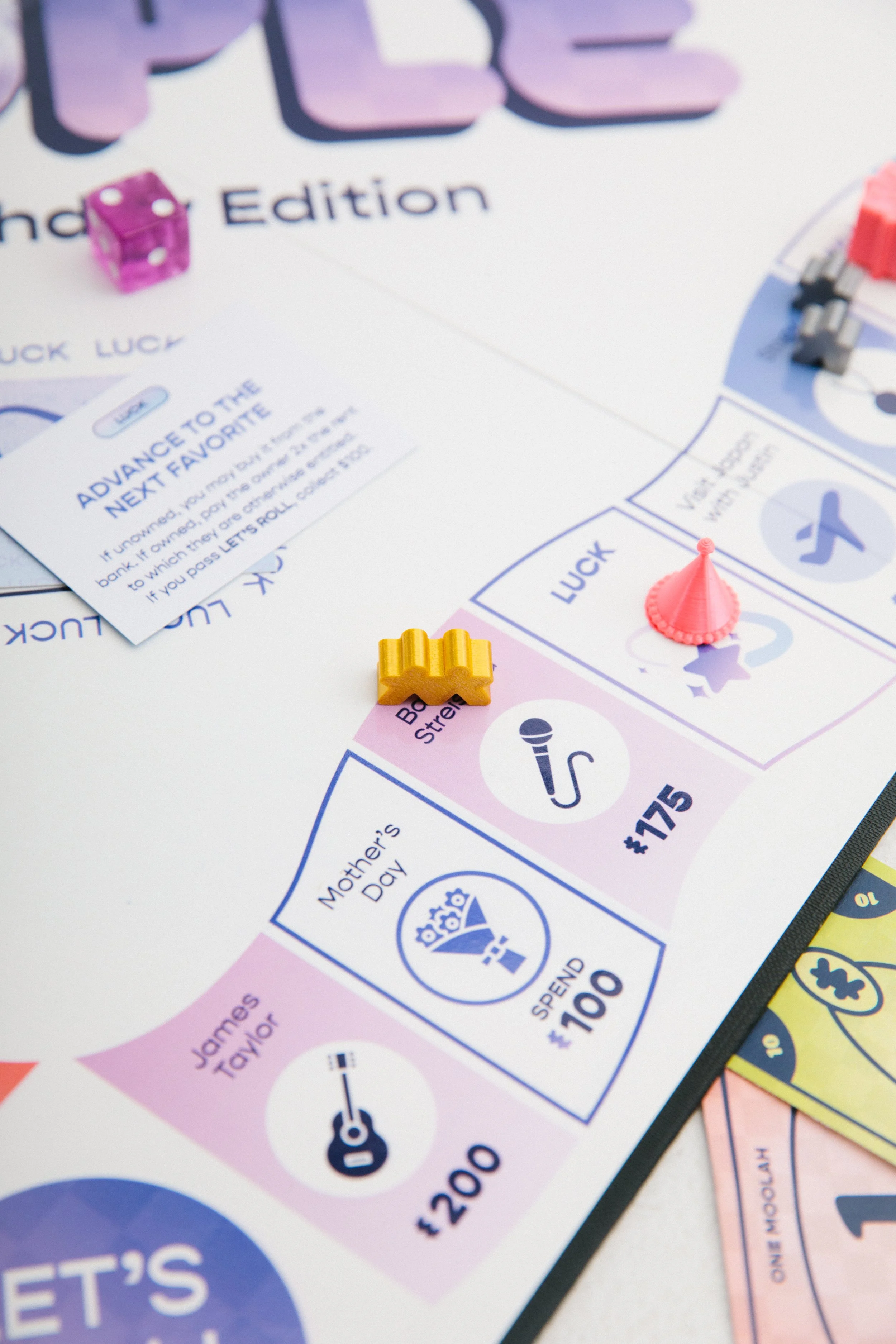
V1 Meople Software (February 2024)
Problem
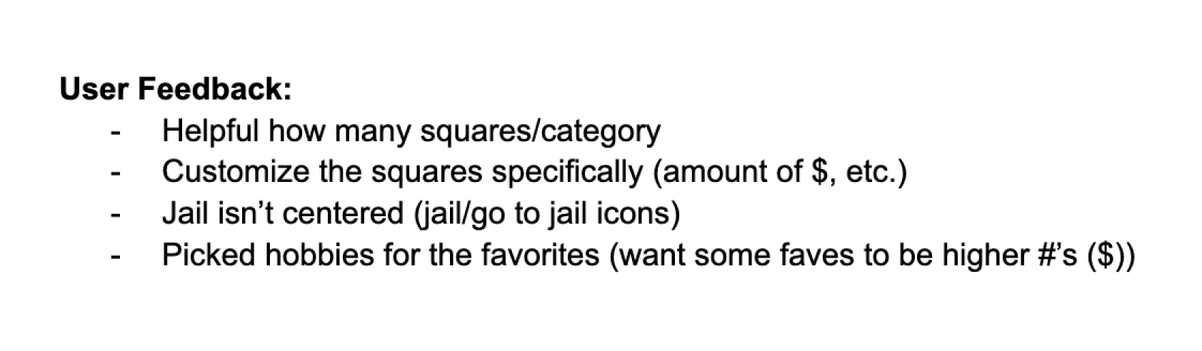
We noticed post-launch that users were inspired by the idea of creating custom games, but were paralyzed by a complex and manual experience. The creation process was highly manual and repetitive where users were required to manually define 50+ variables (names, categories, icons, colors) before seeing the value of their custom game.
This approach caused high cognitive load and significant drop-off during the setup phase.
Goal
My solution was to design a template-driven customization ecosystem to allow users to focus on content while the system handled the visual heavy lifting.
This was supported by the development of Meople’s internal design system, which provided the components necessary to scale these features across physical and digital formats without re-inventing the wheel for each product line.
Discovery
Once the MVP was live, we moved from Zoom screens to the real world. We took our software and physical game samples to multiple in-person events to observe how strangers interacted with Meople without guidance.
This was the most critical stage of our research. Watching users in person revealed the fundamental problem: while the software worked, users were paralyzed by the blank canvas. They struggled to envision the final product and were overwhelmed by the manual effort required.
The Feedback: "I love the concept, but I don't know what looks good. Just give me a starting point so I don't have to figure it out from scratch."
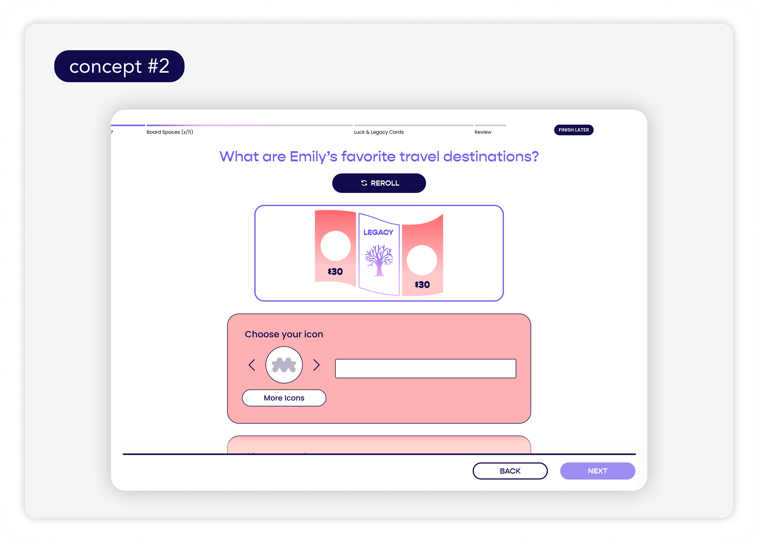
The Shift: I advocated for a template-based editor. Instead of asking users to build, we asked them to choose.
Ideation
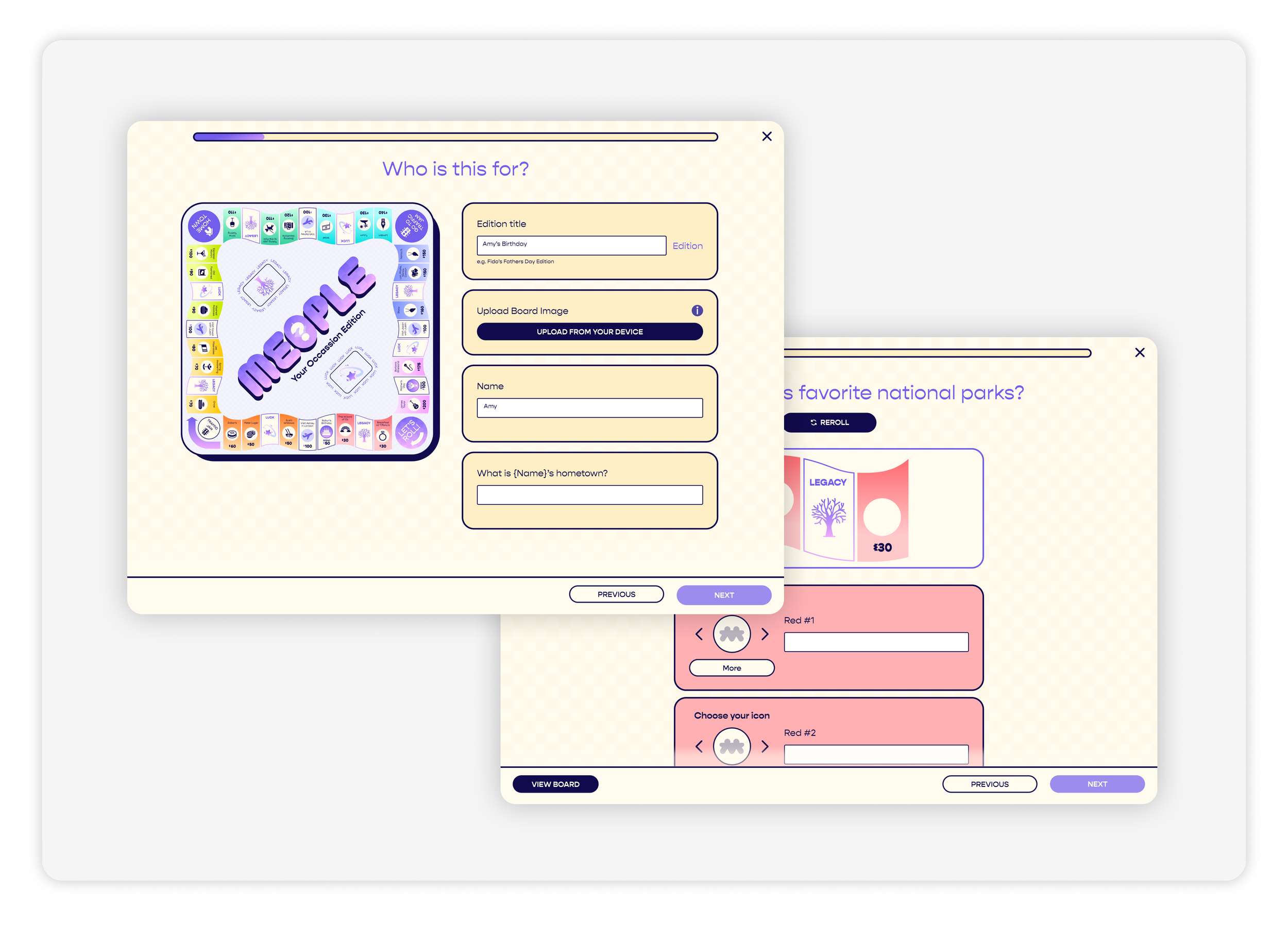
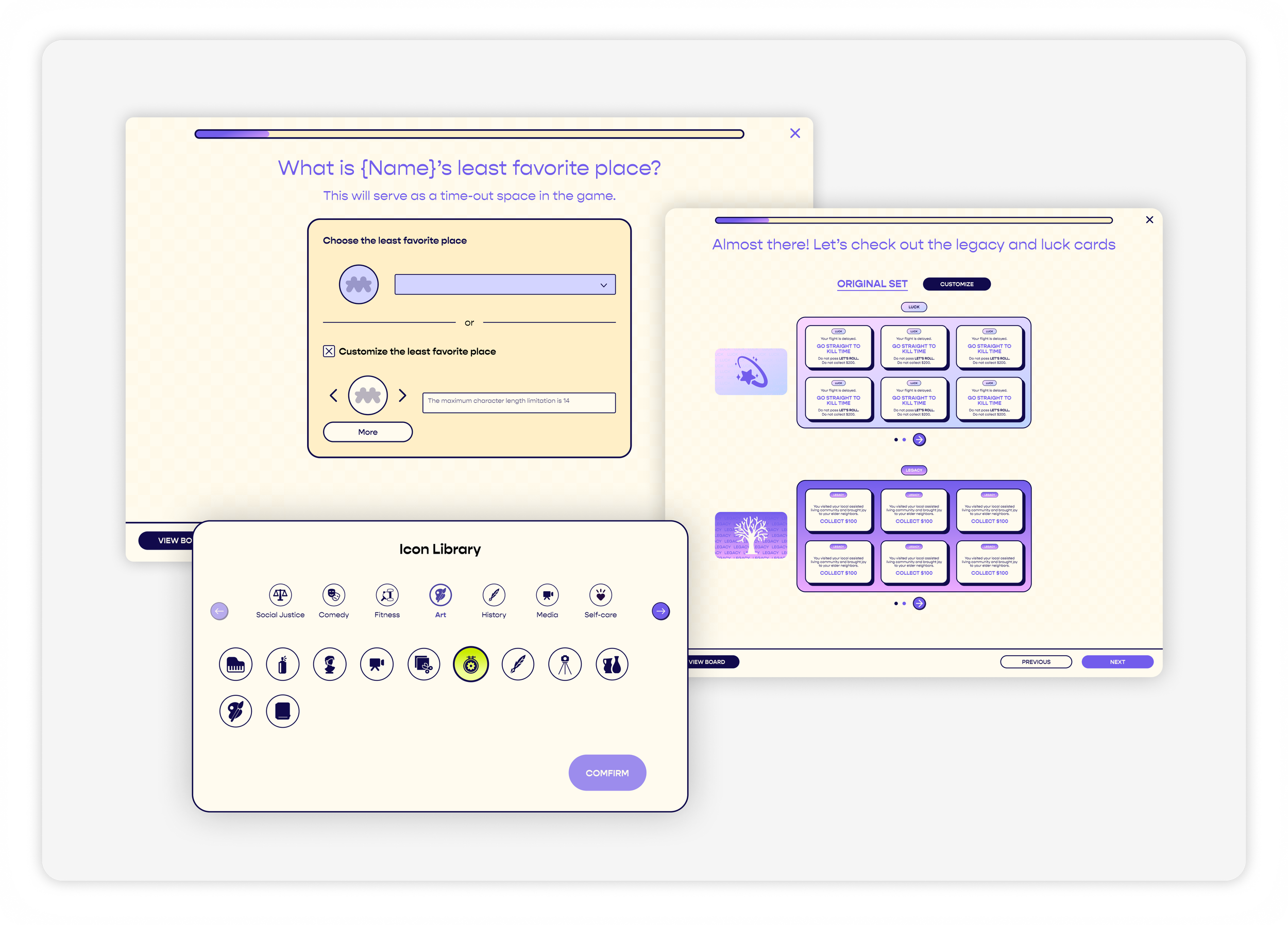
Before jumping into high-fidelity designs, I explored how to bridge the gap between a user’s raw story and a finished game board. This was the critical part of the design process where we brainstormed how to make navigation feel like a game itself and address the initial problem.
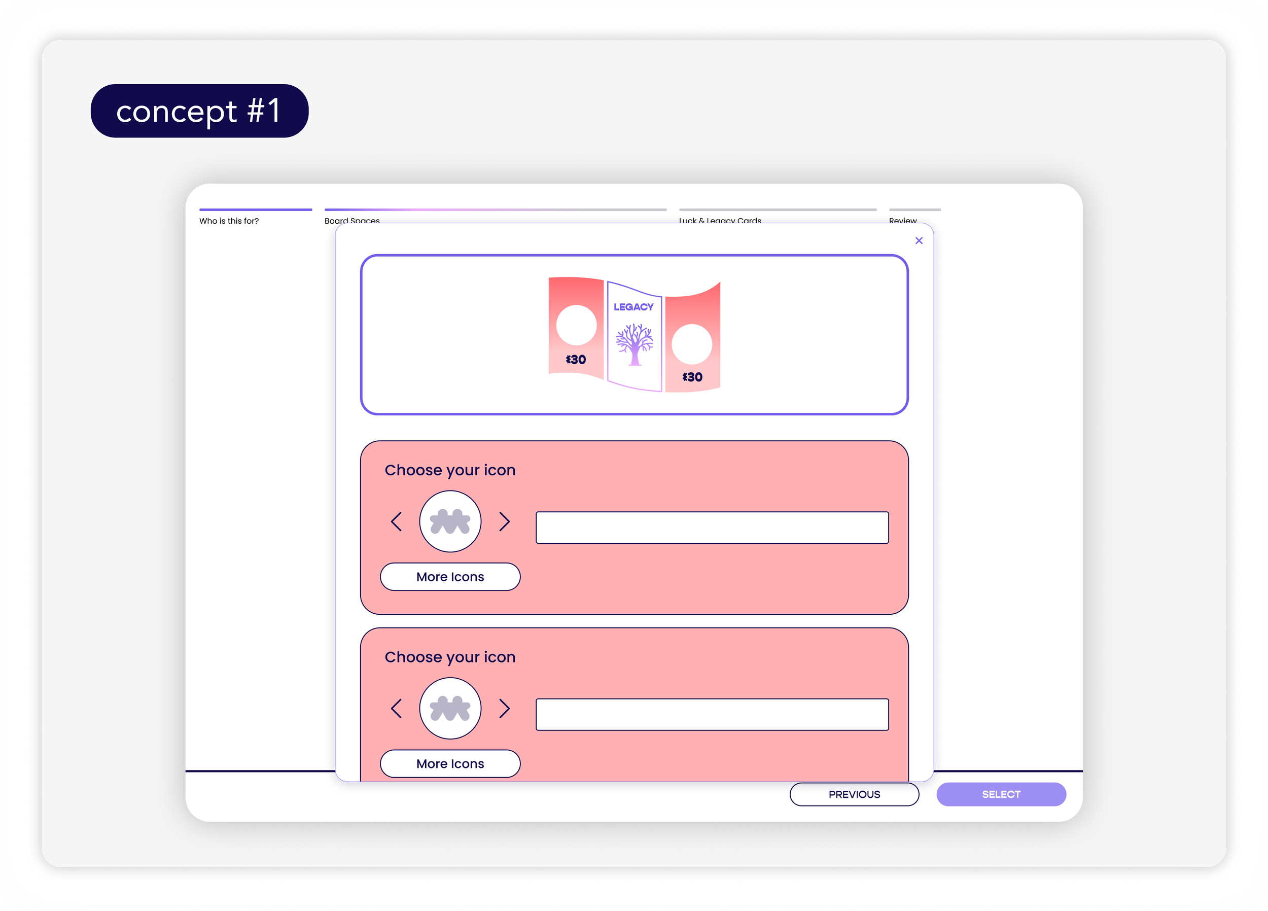
Concept 1: The Step-by-Step I initially sketched a traditional linear flow, but user testing showed it felt like "filling out a tax form." It was too clinical and felt like work.
Concept 2: Modal-Based Workflows: We explored using pop-ups for editing instead of full-page transitions. While this kept the user on the canvas, it cluttered the workspace and felt claustrophobic on smaller screens.
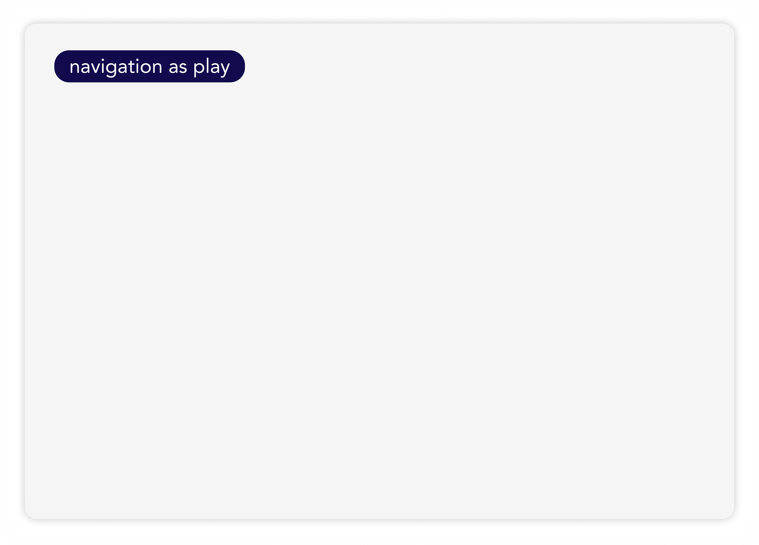
The Winning Idea: We landed on Navigation as Play. By using the board game itself as the dashboard, we realized we could teach users the mechanics of the game while they were still in the setup phase.
Feature Iterations
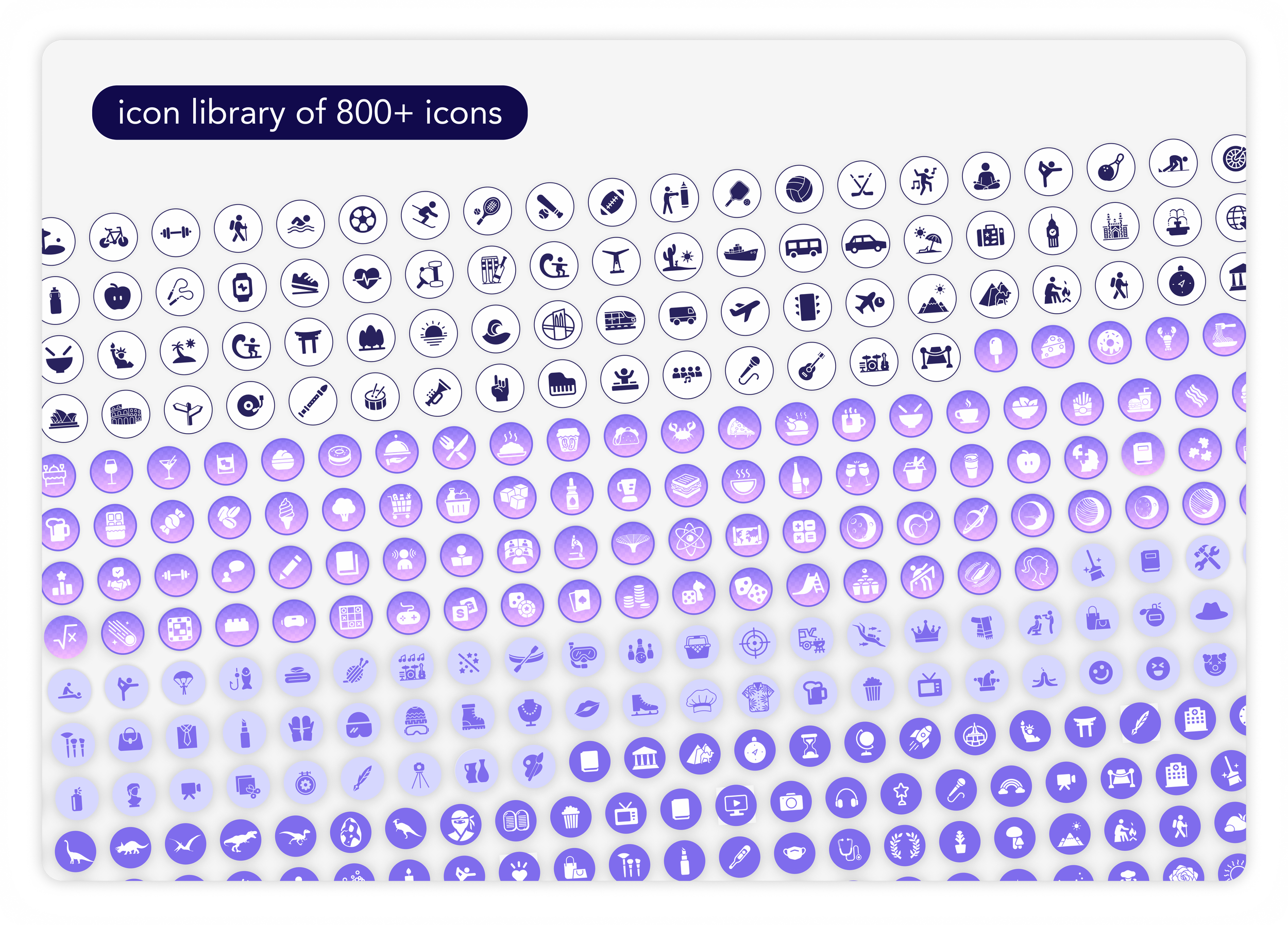
The core of Meople is the customization editor: a workspace handling 50+ variables per game.
Early iterations showed that users were overwhelmed by the high cognitive load of configuring 50 individual cards. It felt like a chore rather than a creative process.
To solve this, I designed the template features. Instead of manual, card-by-card editing, users could apply styles to an entire game instantly.
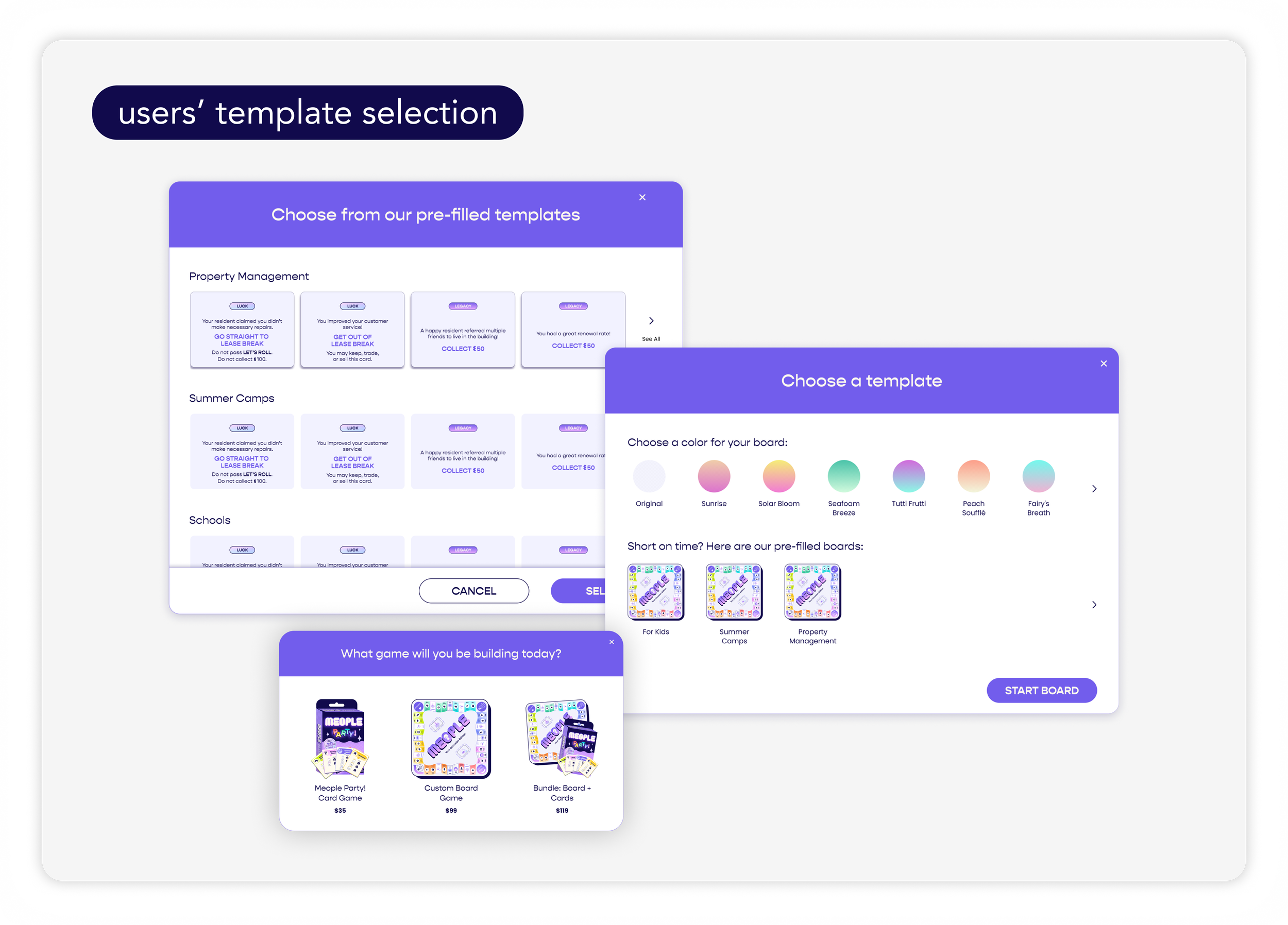
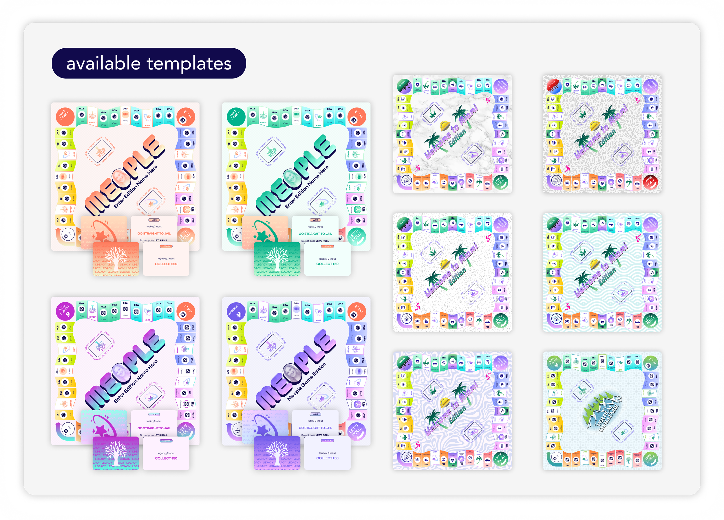
Developing the Design System
In the early days of a startup, speed is everything. However, I realized that our lack of standardization was slowing us down.
I established a formal documentation process that mapped Figma components directly to the codebase. The result was a 50% boost in team efficiency, allowing us to design, prototype, and test iterations within the same week.
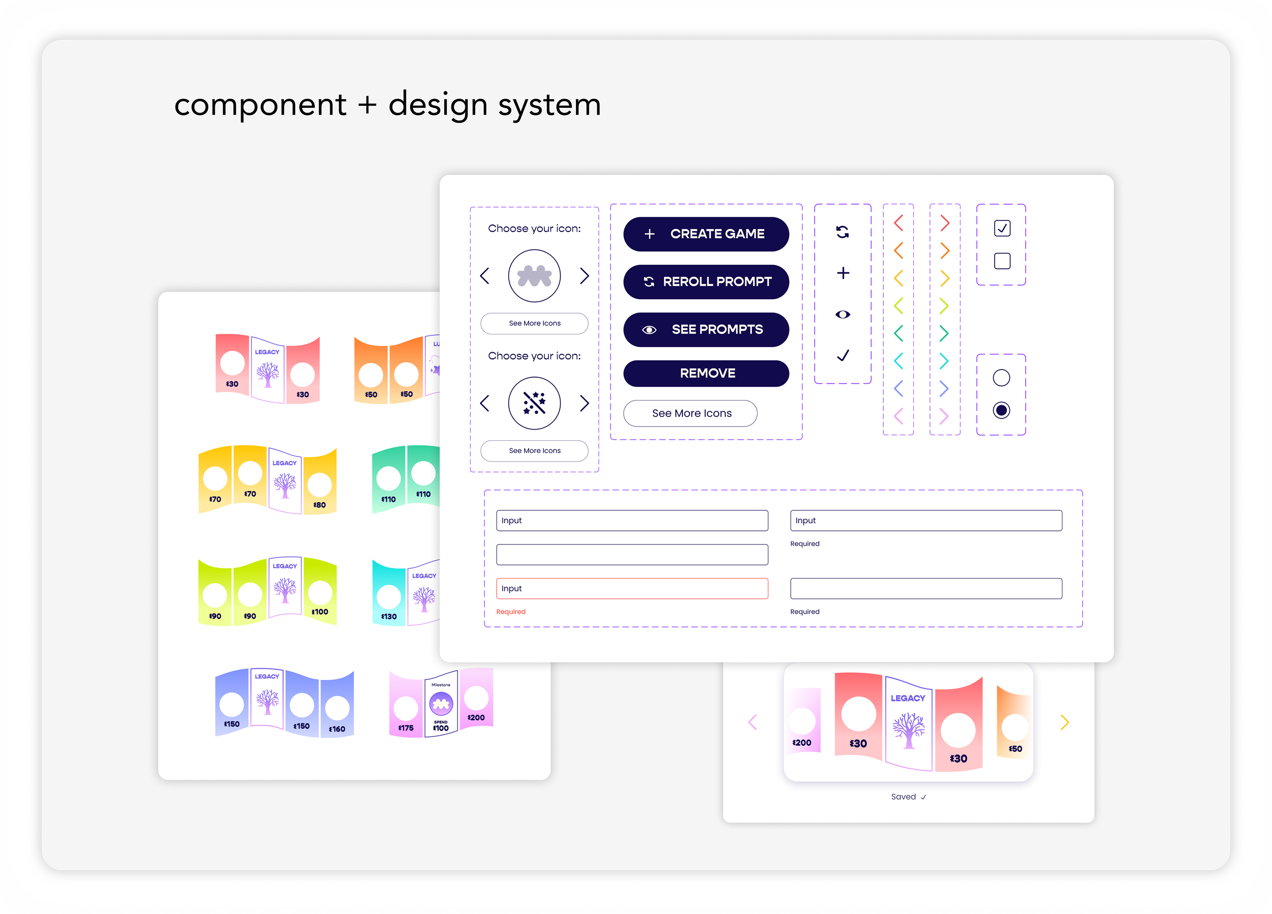
Component LibrariesBranding
The brand identity needed to strike a delicate balance. It had to be "fun" enough for a family game night but "professional" enough for a corporate HR manager to trust for a team-building event. I defined this as Playful Professionalism.
I worked with our graphic designer to create many branding assets from the ground up. By creating these assets early, I ensured the marketing team could move as fast as the product team without creating design bottlenecks.
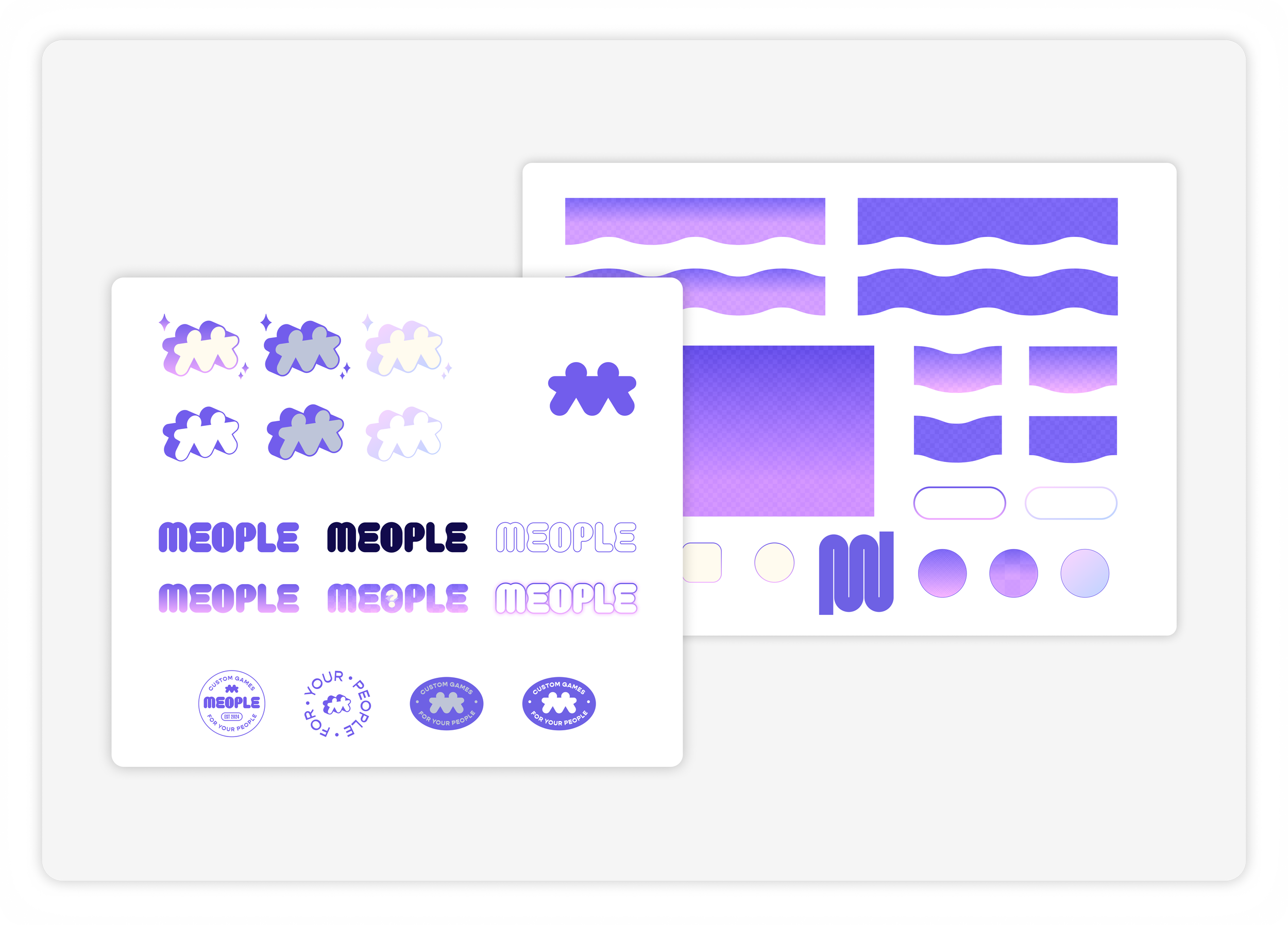
Branding and Marketing AssetsOnboarding Flow
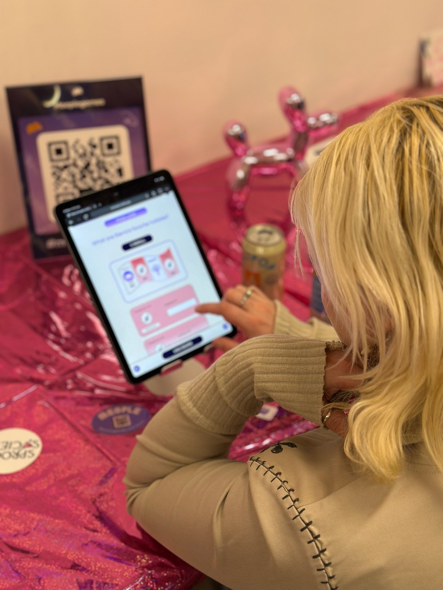
Post-launch analytics revealed another critical friction point: V1 required mandatory email verification which caused a massive drop-off. Users wanted to see the product's value before committing their data.
I advocated for an anonymous preview experience. I redesigned the onboarding to include an optional authentication path, allowing users to reach the design preview phase immediately.
By allowing users to feel the value of the product before asking for data, we lowered the barrier to entry while still honoring lead capture goals.
The result was a 25% reduction in onboarding time and a 7% increase in conversion rates.
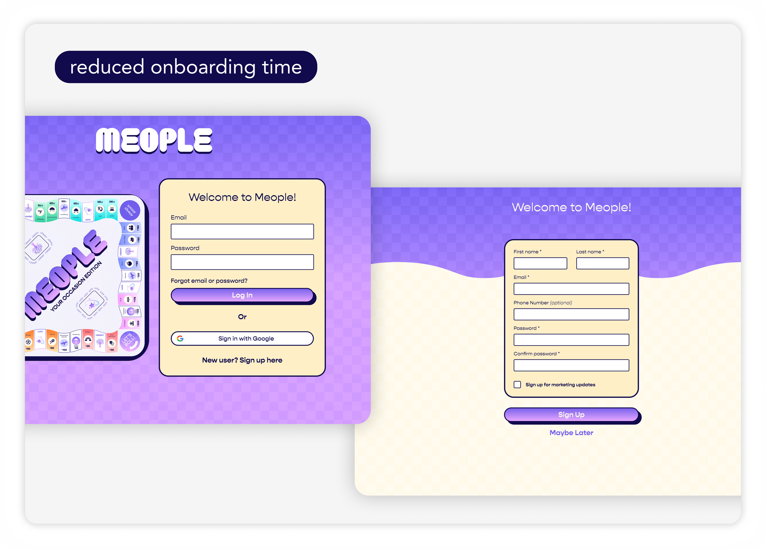
Onboarding Flow: Low-Friction Entry Increased Overall User Engagement Outcomes and Impact
Not dwelling on perfection: I learned to prioritize the big picture over minor details to meet aggressive launch goals. Shipping an imperfect product allowed us to gather real-world data far faster than any isolated usability test could.
Building the design system: Building the design system wasn't just about consistency; it was about survival. Standardizing our components allowed us to execute the product roadmap with a velocity that matched the startup's speed.
Advocacy : Balancing business goals (lead capture) with user needs (low-friction entry) through creative compromises resulted in a more successful outcome for both parties, proving that design advocacy is a strategic asset.