
Veba Baby
UI Design • Prototyping • Wireframing • Competitor Analysis
Designing an engaging and intuitive customer navigation experience for users, prioritizing increased customer engagement.
May 2024 – June 2024
Overview
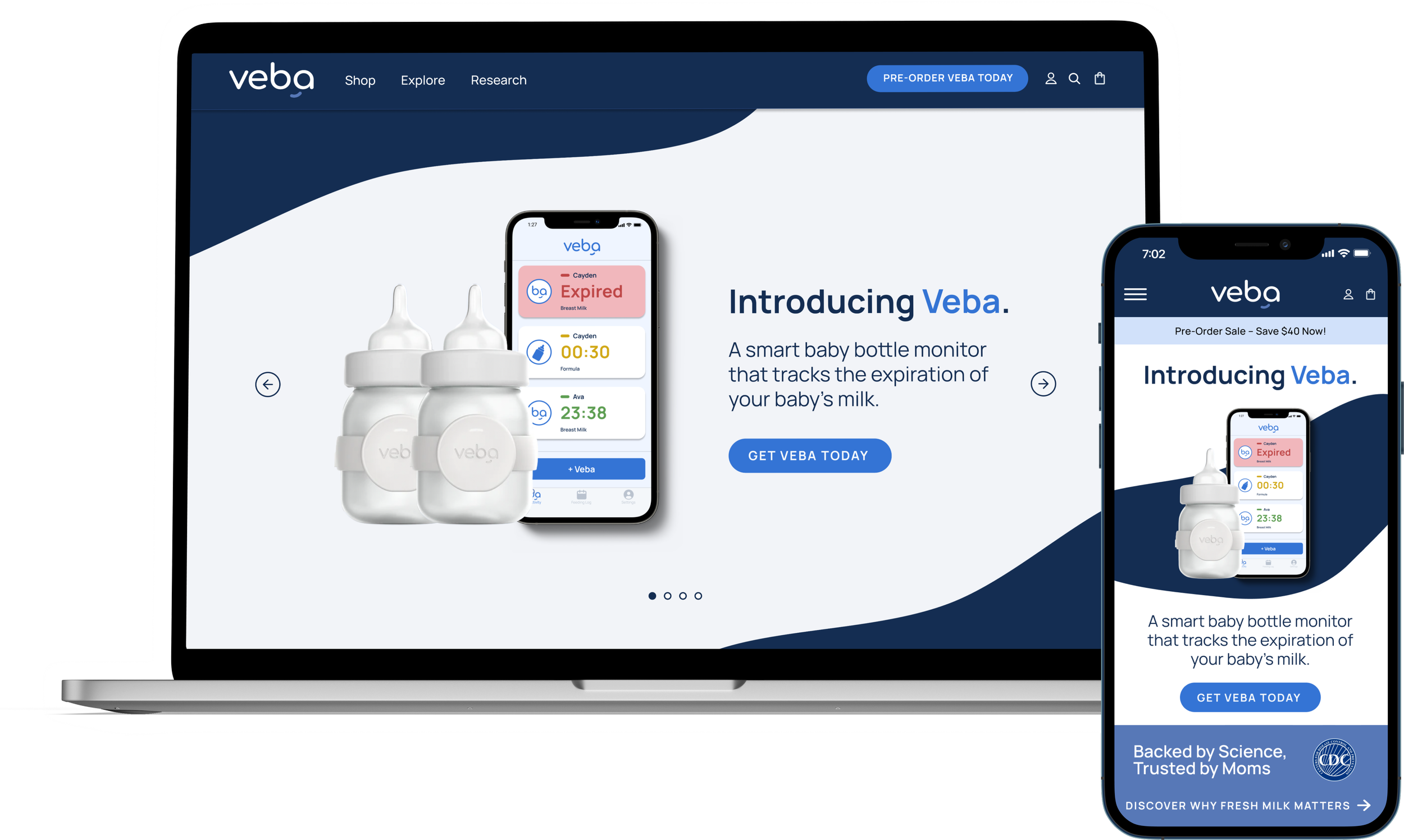
Veba Baby has just launched an app to accompany their physical product that will ship to their first customers in the coming weeks. The goal of this project is to reimagine the Veba Baby website–currently a single scroll experience–to create a user navigation experience that is streamlined and engaging for future users.
Role
My team, consisting of two UX designers and myself, had a turnaround time of 4 weeks for this entire project. Given the time and resource constraints, we talked to the stakeholders and came up with a viable project plan and what deliverables would be feasible: industry and competitor research, comprehensive design recommendations, iterate based on client feedback, and prototyping.
Tools
Team
x3 Designers
Research

For the competitor research, we conducted heuristic evaluation of three companies with each team member focusing on one. Additionally, the research centered around: how companies are portraying the research behind their product, how product features are being presented, CTAs for the company’s compatible mobile app, the use of social proof (in the form of user testimonials), and patterns in color schemes.
Design

Iterate

Process
After synthesizing the research and conducting a UI audit on Veba Baby’s website, we shared our design recommendations with the client. The redesign’s goal was to create an intuitive, engaging, and educational user experience for Veba Baby’s target audience of new and expecting mothers. The recommendations included revised information architecture, an updated navigation bar and footer, a complete revamp of the FAQ page, an additional page to share the scientific backing behind the product, and more.
Due to the time and resource constraints, we were only able to iterate our designs based on our client’s feedback (rather than conducting usability testing and gathering user feedback). Fortunately, Veba Baby agreed to conduct their own testing on our final designs. We were able to present high-fidelity mockups in two different color schemes and a full-functioning prototype for the client to test.
Competitive Analysis & Industry Research
Our team found three companies that exist in the baby-product space with an excellent user experience. These companies have very similar target audiences as Veba Baby and by analyzing these websites, I gained a clearer picture of industry standards and what users might be expecting. For this analysis, I focused on: the graphics used, what kind of social proof is available, FAQ pages, designated research pages, product feature displays, and the color schemes.
Revised Information Architecture
To streamline the user journey and build immediate brand authority, the site’s hierarchy was restructured to prioritize high-value content:
Introduced a Research page to the primary hierarchy, providing transparent access to scientific backing to increase product credibility and consumer confidence.
Grouped "FAQ" and "About Us" under a new Explore category to simplify the mental model for new users.
Relegated the "Contact" link to the footer, ensuring the main menu remains focused on the core conversion path and product education.
Design
Our design recommendations had been carefully crafted based on an extensive audit of Veba Baby’s current website, along with a thorough competitor analysis. The goal of this redesign is to simplify the overall user experience, while also being engaging and educational. Additionally with this redesign, we hope to emphasize the value of Veba Baby’s product for all users and especially, the target audience of new and expecting parents.
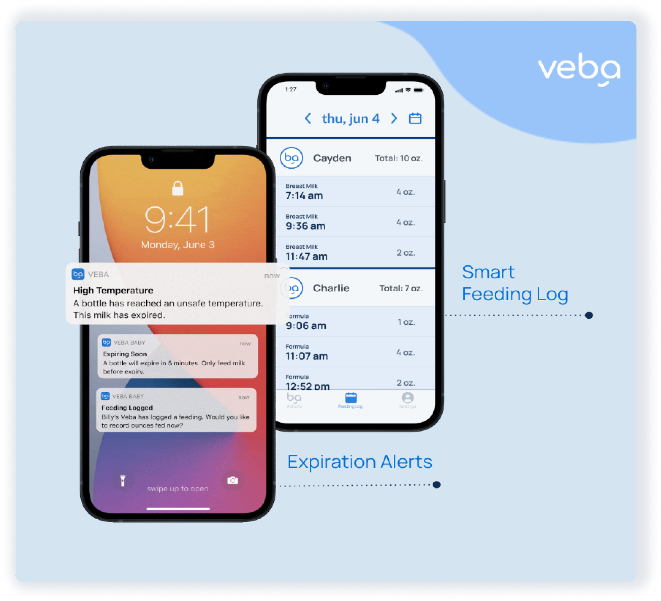
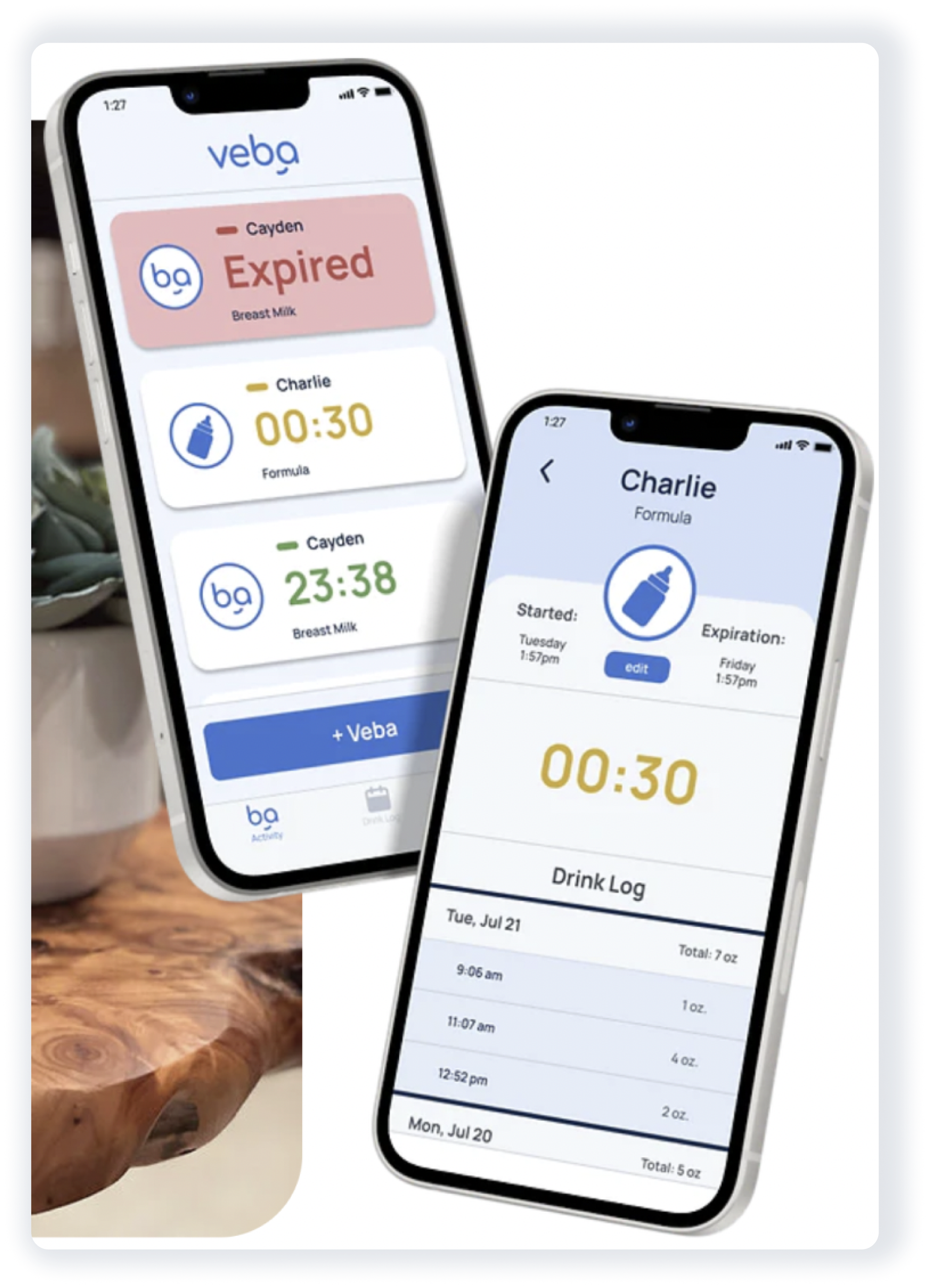
Graphics
Rather than solely using still images of the mobile app, we recommend implementing a more detailed and engaging approach to displaying the product’s features. The mobile app images are now paired with specific call-outs that label what the benefit of the mobile app are and how those benefits fit into context with the product. Additionally, the image has enlarged notifications to emphasize the convenience of syncing your product with the app.
Redesigned
Original
Nav Bar
The navigation UI was redesigned to reflect a premium brand identity while improving functional clarity:
Applied a deep blue palette to the navigation bar to evoke a sense of professional reliability and high-end quality.
Repurposed the brand logo as the "Home" link. This design choice removed redundant text, increased white space, and created a more modern, sophisticated aesthetic.
By reducing the total number of top-level menu items, the new layout emphasizes the most important pages, making the interface feel intentional and easy to navigate.

Redesigned

Original
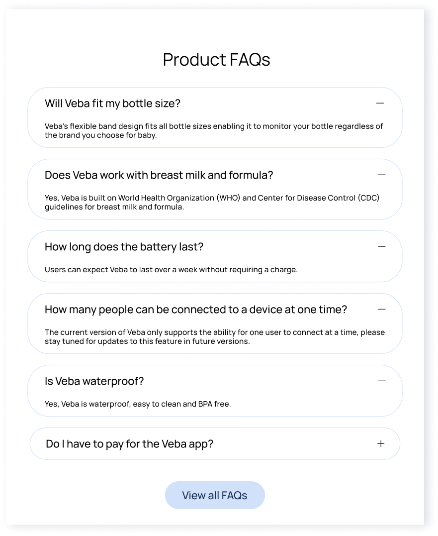
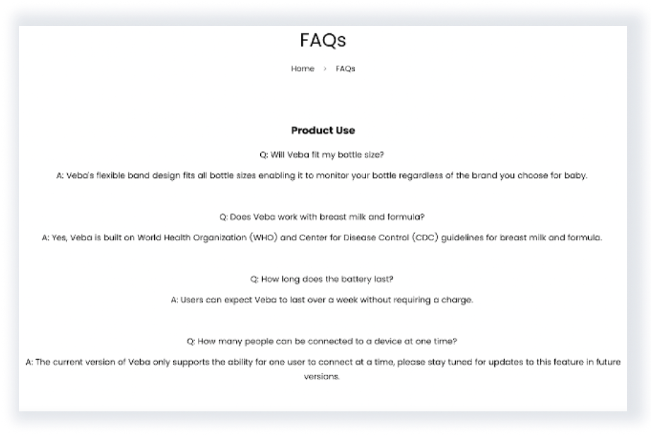
FAQ Page
The original FAQ page consisted of a static, plain-text list that created high cognitive load and made it difficult for users to locate specific information. The redesign focuses on scannability and interaction:
Implemented expandable accordion components to hide answers until needed. This reduces visual clutter and allows users to scan questions without being overwhelmed by text.
Transitioned to left-aligned typography to provide a consistent visual anchor, supporting the natural "F-pattern" reading style and allowing for quicker information retrieval.
Redesigned
Original